How Big Companies Make Bad Website User Interface Decisions
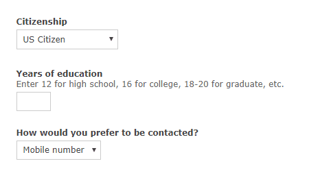
The bank shall remain nameless but I came across this question…

Notice how instead of using a drop down for education they ask the user to enter a number? Why on earth would I enter a number for my schooling instead of using a drop down to select (High School, College, or Graduate). Also, what happens if I enter 19? Does that mean I went to graduate school but didn’t finish? Again, I’m not trying to be negative here but really? Web developers and web designers have been using the drop down box since HTML was invented.
Later in the online form I was asked for my “Relationship Status” I answered “Married.” So the site asked me for my wife’s information. It then asked me “Spouses marital status?” Seriously, you are asking me for my spouses Marital Status?
Yes this was a bit of a sarcastic blog but for those of you in the web or application development industry please do not repeat these mistakes.